Brand Perfect
I designed and typeset Brand Perfect’s research about the Internet of Things, and art-directed illustrations to bring the research to life. Using the modular grid of Brand Perfect’s parent company Monotype, I scaled the design down to work on digital devices.
Cover
I chose black foil-blocking for the cover to give it a tactile finish. The typography on the front cover relates to the inside titles.


Grid and typography
The modular grid allows for text and image to be displayed in an interesting way. I combined serif and sans-serif typefaces Ysobel and DIN Next, and used pull quotes to pick out key information.


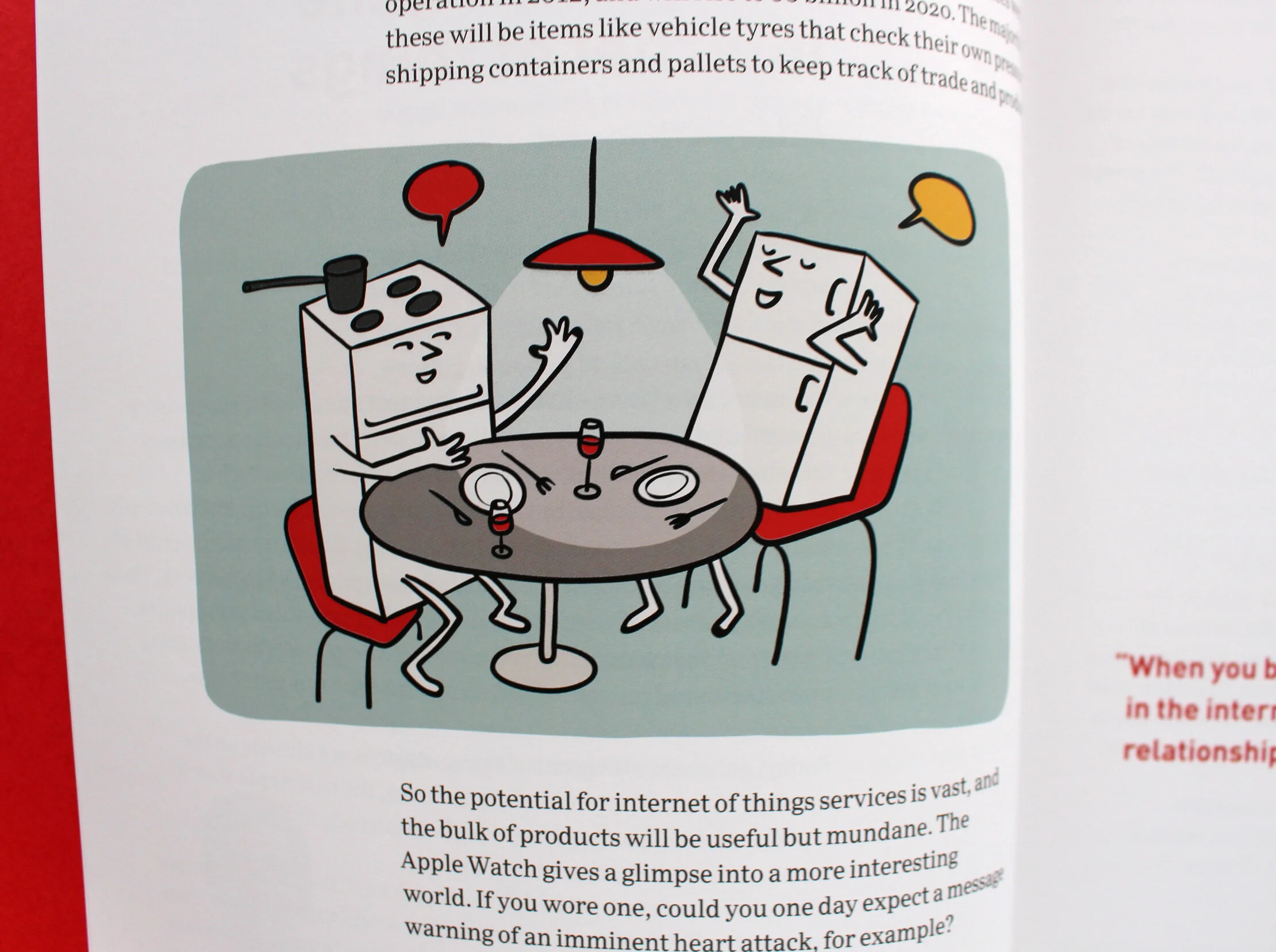
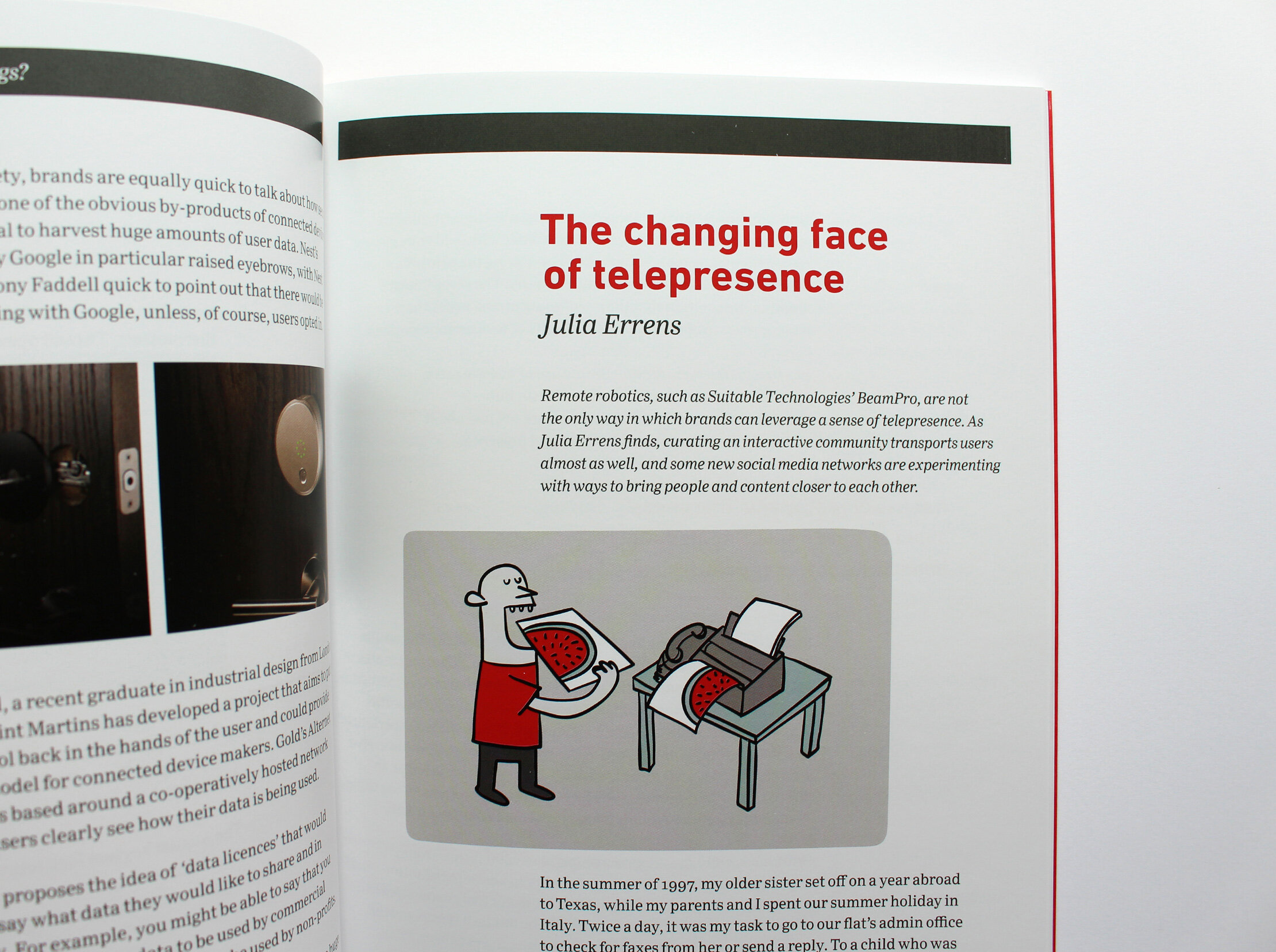
Art direction
I art-directed Laura Barnard’s illustrations, based on the concepts of technology diminishing the difference between physical and digital objects, and devices talking to each other.
Translation article
The article on machine translation demanded a variation to the design to make it stand out, so I set this in the secondary type family DIN Next. Part of this task was image research to communicate the article’s message visually.

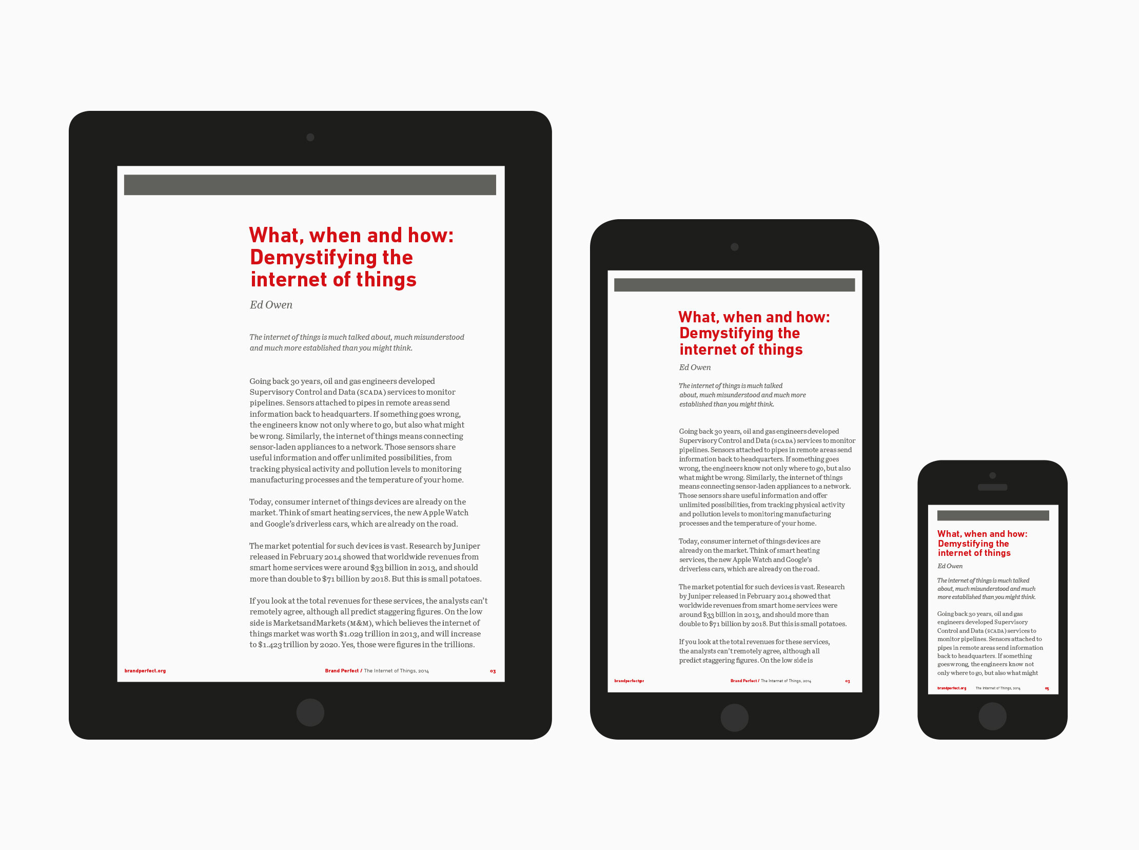
Digital devices
I scaled down the print design for desktop, mobile and tablet screens using the modular grid. This ensured the design was consistent across different devices.