Chaplin Farrant Architects
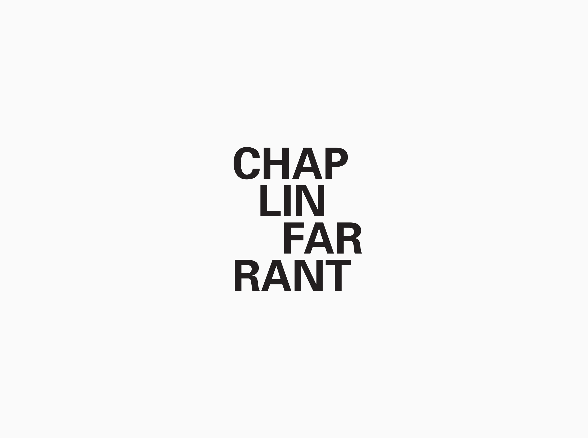
For Chaplin Farrant’s brand identity, I created a logotype with different variations to evoke the modular style of the architects’ projects. I developed a modular grid for documents and based the colour palette on building materials in order to connect the identity to the nature of the company.
Logotypes
The four different logotype variations.
Colour Palette
Based on building materials used in the practice’s projects.
Stationery:
Grid
The grid and its application to documents.
Website
I used a modular layout for the homepage design to showcase the practice’s projects. The website scales down to fit different devices.


